Notabene
Brand Guidelines

You may not use, reproduce, distribute, or modify any content from this site for public or commercial purposes without prior written permission from Notabene.
Table of Contents
This document outlines the core elements of the Notabene visual identity system. It serves as a reference for maintaining consistency across all communications and touchpoints.
Notabene Vision
Purpose
Our mission is to make digital assets a part of the everyday economy.
By enabling safe and trusted digital asset transactions, Notabene helps financial institutions unlock their full potential in today's dynamic economy.
DIFFERENTIATION
Holistic platform
Domain expertise
Operational excellence
Strategic integration
PRINCIPLES
Demystify complexity
Build ethical technology
Innovate responsibly
Earn trust
Visual Identity
Brand Marks
Download logo filesThe logo is constructed to reflect the core attributes of the brand. It is the most recognizable element of the visual identity and should be used consistently and respectfully across all applications.
The relationship between symbol, typography, and spacing has been carefully defined to ensure clarity, balance, and legibility at all sizes.
Main Logo

Symbol

Backgrounds
The brand mark should always maintain strong contrast against its background.
Use approved color variations as specified in this guide. When placing the logo over photography or textured backgrounds, ensure it sits on a visually calm area to preserve legibility and impact.
Avoid backgrounds that reduce clarity or interfere with recognition.

Brand Mark Don'ts
To preserve brand integrity, the logo must never be altered or modified.
Do not distort, rotate, recolor outside approved variations, add effects, change proportions, or rearrange elements. Consistent usage reinforces recognition and ensures a cohesive brand presence across all platforms.
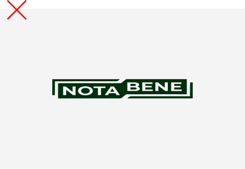
Don’t change the proportion of the logo.
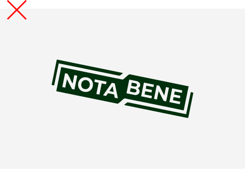
Don’t rotate the logo.

Don’t use it inside of a fill or stroke box.
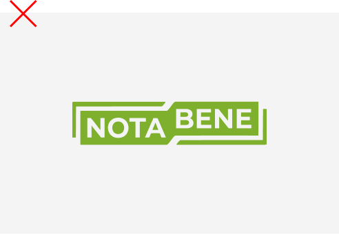
Don’t use unspecified colors.
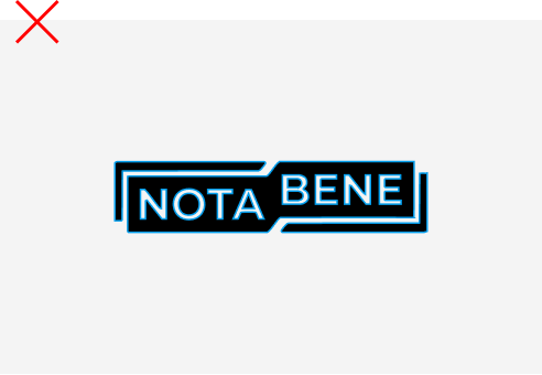
Don’t outline the logo.
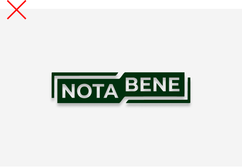
Don’t use drop shadow.
Color
Primary Palette
The primary color palette defines the core visual identity of the brand.
These colors should be used prominently across key brand touchpoints. They establish tone, reinforce recognition, and provide visual consistency across digital and physical applications. Always use the specified color values to maintain accuracy.
WHITE
RGB
(255,255,255)
HEX
#FFFFFF
CMYK
0%, 0%, 0%, 0%
OFF-WHITE
RGB
(250, 248, 242)
HEX
#FAF8F2
CMYK
0%, 1%, 3%, 2%
DARK GREEN
RGB
(0, 47, 13)
HEX
#002F0D
CMYK
100%, 0%, 72%, 82%
ELECTRIC GREEN
RGB
(150, 241, 4)
HEX
#96F104
CMYK
38%, 0%, 98%, 5%
NOTABENE GREEN
RGB
(65, 225, 41)
HEX
#41E129
CMYK
71%, 0%, 82%, 12%
BASE GREEN
RGB
(192, 239, 205)
HEX
#C0EFCD
CMYK
20%, 0%, 14%, 6%
ELECTRIC BLUE
RGB
(127, 237, 229)
HEX
#7FEDE5
CMYK
46%, 0%, 3%, 7%
Color Palette Dont’s

Do not use solid colors outside of the brand color palettes

Do not use illegible color combinations

Do not use unapproved gradients

Don’t use unspecified color combinations
Typography
Download fontsPrimary Typeface
Roboto Slab is the main typographic voice of the brand. The typeface reflects the brand’s tone and ensures clarity, readability, and consistency across all materials.
If digital limitations apply, approved fallback option is Courier New.
Roboto Slab
ABCDEFGHIJKLMNOPQERSTUVWXYZ abcdefghijklmnopqrstuvwxyz 1234567890#&$€%@!?*
Styles & Weights
Regular
Type Hierarchy
Clear typographic hierarchy ensures information is organized and easy to navigate.
Differences in size, weight, spacing, and alignment should be used intentionally to guide the reader’s attention. Consistent application of hierarchy strengthens brand recognition and improves overall communication clarity.
Headline Large
Roboto Slab - Regular
100% Line Height
The trust layer
Headline Small
Roboto Slab - Regular
120% Line Height
Our mission is to make digital assets a part of the everyday economy.
Special Character
Roboto Slab - Regular
120% Line Height
Lorem ipsum dolor sit amet consectetur adipiscing elit. Quisque faucibus ex sapien vitae pellentesque sem placerat. In id cursus mi pretium tellus duis convallis. Tempus leo eu aenean sed diam urna tempor. Pulvinar vivamus fringilla lacus nec metus bibendum egestas. Iaculis massa nisl malesuada lacinia integer nunc posuere. Ut hendrerit semper vel class aptent taciti sociosqu. Ad litora torquent per conubia nostra inceptos himenaeos.
Body Text
Inter - Regular
120% Line Height
Lorem ipsum dolor sit amet consectetur adipiscing elit. Quisque faucibus ex sapien vitae pellentesque sem placerat. In id cursus mi pretium tellus duis convallis. Tempus leo eu aenean sed diam urna tempor. Pulvinar vivamus fringilla lacus nec metus bibendum egestas. Iaculis massa nisl malesuada lacinia integer nunc posuere. Ut hendrerit semper vel class aptent taciti sociosqu. Ad litora torquent per conubia nostra inceptos himenaeos.
Kit of Parts
Applications
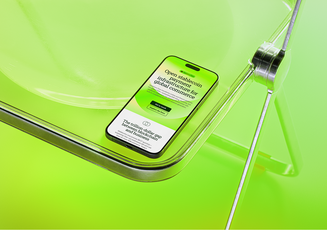
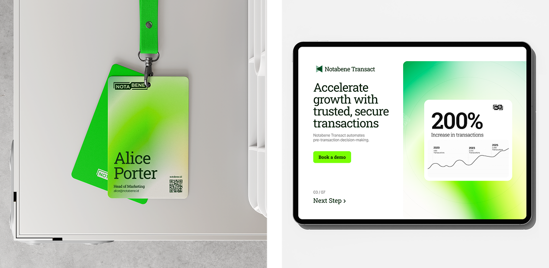
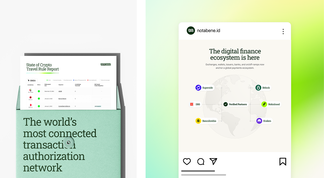
This section demonstrates how brand elements work together in practical applications.
It provides examples of color usage, typography, imagery, layout structure, and composition principles. Use these references when creating new materials to ensure visual consistency and alignment with the overall brand system.